What Does the Chart Say? Grouping Cues Guide Viewer Comparisons and Conclusions in Bar Charts


What Does the Chart Say? Grouping Cues Guide Viewer Comparisons and Conclusions in Bar Charts
Cindy Xiong Bearfield, Chase Stokes, Andrew Lovett, Steven Franconeri
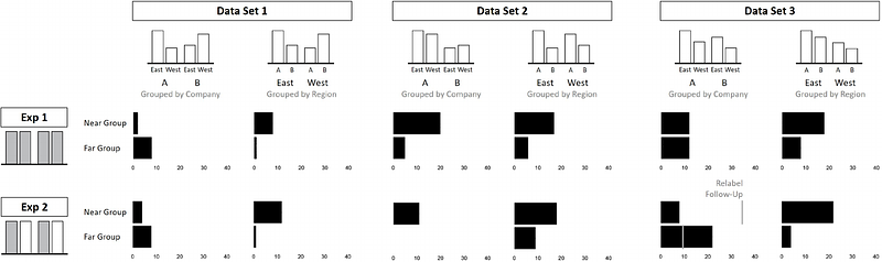
AbstractReading a visualization is like reading a paragraph. Each sentence is a comparison: the mean of these is higher than those; this difference is smaller than that. What determines which comparisons are made first? The viewer's goals and expertise matter, but the way that values are visually grouped together within the chart also impacts those comparisons. Research from psychology suggests that comparisons involve multiple steps. First, the viewer divides the visualization into a set of units. This might include a single bar or a grouped set of bars. Then the viewer selects and compares two of these units, perhaps noting that one pair of bars is longer than another. Viewers might take an additional third step and perform a second-order comparison, perhaps determining that the difference between one pair of bars is greater than the difference between another pair. We create a visual comparison taxonomy that allows us to develop and test a sequence of hypotheses about which comparisons people are more likely to make when reading a visualization. We find that people tend to compare two groups before comparing two individual bars and that second-order comparisons are rare. Visual cues like spatial proximity and color can influence which elements are grouped together and selected for comparison, with spatial proximity being a stronger grouping cue. Interestingly, once the viewer grouped together and compared a set of bars, regardless of whether the group is formed by spatial proximity or color similarity, they no longer consider other possible groupings in their comparisons.